FPE vs Homeruns
Understanding the “Homeruns” Chart
What is going on here?
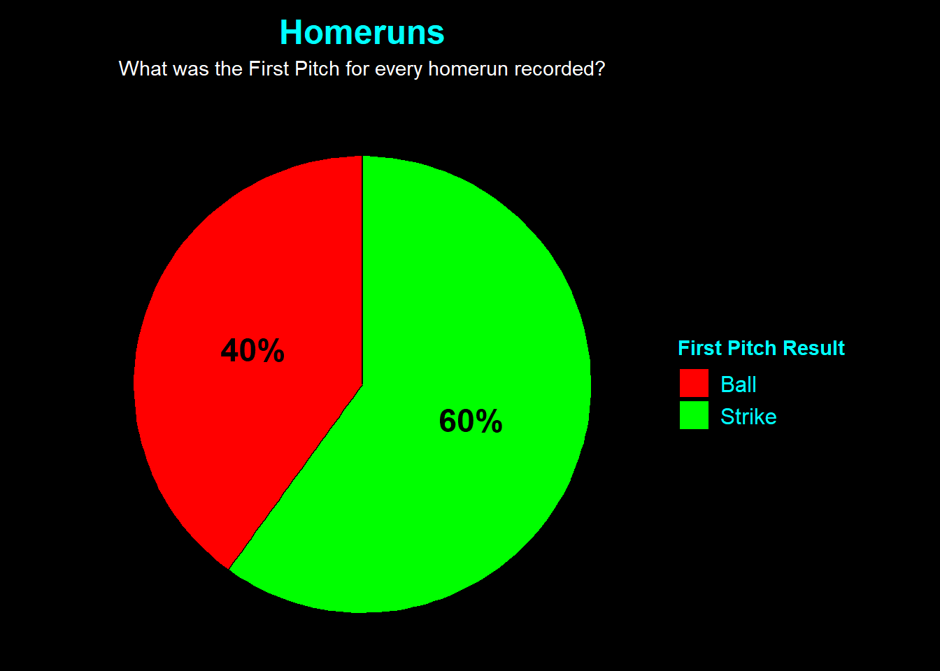
This chart looks exclusively at the most damaging outcome in baseball: the Home Run. It categorizes every homer hit in the dataset by how the at-bat began:
Green Slice (Strike): The HR occurred after the pitcher got ahead 0-1.
Red Slice (Ball): The HR occurred after the pitcher fell behind 1-0.
⚠️ Why this data can be misleading
Similar to the Hits chart, you might see a large Green slice and assume that getting ahead 0-1 is dangerous.
Aggression vs. Predictability: Pitchers often attack the zone early to get ahead. While this leads to more strikeouts, it also means they are around the plate more often, providing opportunities for solo home runs.
The “Ambush” Factor: Modern hitters are trained to swing at the first pitch if it’s a fastball in the middle. This results in many home runs happening on the very first pitch (which counts as a 0-1 start in this specific data view context if filtered that way, or implies the pitcher was challenging the hitter).
The Takeaway: Despite the green slice likely being large, the rate of home runs per pitch is usually much higher when a pitcher falls behind (1-0, 2-0) because they are forced to throw a “get-me-over” fastball that hitters can crush.